Home/ ADA Signs/ ADA Compliant Fonts
ADA Signage Guide

ADA compliant fonts.
There is no official list.

The Standard never names a typeface. It describes a shape, then gives you two ratios you can measure with a caliper, a capital I and a capital O. Here are both, with the faces that clear them measured rather than guessed.

O WIDTH I HEIGHT
The Rule
01

A shape, then
two ratios.

Every compliance question about a typeface comes down to one sentence of style and two numbers. Miss any of the three and the sign fails, whatever the font is called.

“Characters shall be sans serif. Characters shall not be italic, oblique, script, highly decorative, or of other unusual forms.” 2010 ADA Standards for Accessible Design — 703.2.3 Style
Character proportion

Width of the capital O against the height of the capital I. 55% to 110% federal, 60% to 110% in California. This is the rule that kills condensed and extended faces.

Stroke thickness

Thickness of the upright of the capital I against its own height. 15% maximum on raised characters, federal and California alike. This is the rule that kills bold and black weights.

The limits, side by side

MeasurementFederal 2010 ADACalifornia CBC 11B
O width vs I height55% – 110%60% – 110%
Stroke, raised characters15% max15% max
Stroke, visual characters10% – 30%10% – 20%
Case, raised charactersUppercase onlyUppercase only
Character height, raised5/8″ – 2″5/8″ – 2″
Raise above background1/32″ min1/32″ min

Where the two disagree we build to California, because a sign that passes 11B passes the federal standard everywhere else. The ratios settle the typeface. What the inspector does next is Braille, mounting height and contrast, and those fail signs just as often.

Measured
02

Eight faces,
drawn from the real files.

Every plate below is an image of the actual typeface, rendered from its own font file at a matched cap height on the same black field. Not live web type, so what you are looking at is what everyone is looking at.

Cap line Baseline Every plate set to an identical cap height
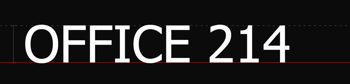
OFFICE 214 set in Helvetica / Arial on a black sign plate, white characters, with the cap line and baseline marked in red
Helvetica / Arial
O / I 96–97% Stroke 13–14% Passes

The default on most sign schedules. The plate shows Helvetica; Arial sits one point narrower and is what most machines substitute for it. Neither one is a risk.

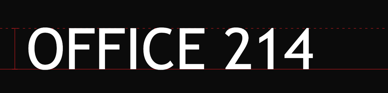
OFFICE 214 set in Verdana on a black sign plate, white characters, with the cap line and baseline marked in red
Verdana
O / I 93% Stroke 13% Passes

The widest of the group. Open counters and loose spacing make it the easiest to read at 5/8″ caps, but it eats plate width fast.

OFFICE 214 set in Tahoma on a black sign plate, white characters, with the cap line and baseline marked in red
Tahoma
O / I 88% Stroke 13% Passes

Verdana’s tighter sibling. Same skeleton, narrower letters. Fits more text on a small plate without losing clarity.

OFFICE 214 set in Trebuchet MS on a black sign plate, white characters, with the cap line and baseline marked in red
Trebuchet MS
O / I 83% Stroke 14% Passes

The narrowest here and still comfortably inside both ranges, including California’s 60% floor.

OFFICE 214 set in Avenir on a black sign plate, white characters, with the cap line and baseline marked in red
Avenir
O / I 104% Stroke 10% Passes

Geometric with open counters and the lightest stroke of the group at 10%. Turns up in a lot of newer buildings.

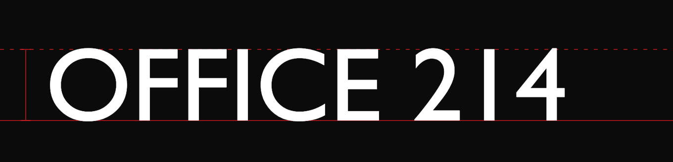
OFFICE 214 set in Gill Sans on a black sign plate, white characters, with the cap line and baseline marked in red
Gill Sans
O / I 108% Stroke 14% Passes, near the width ceiling

Inside both ranges but two points off the 110% width ceiling. Comfortable on a wide plate, tight on a small one.

OFFICE 214 set in Futura, regular weight on a black sign plate, white characters, with the cap line and baseline marked in red
Futura, regular weight
O / I 105% Stroke 15% Over the stroke ceiling

Geometric, an architect favourite, and the reason to read the weight on the schedule. At regular it measures 15%, which is over. Specify Futura Book.

OFFICE 214 set in Optima on a black sign plate, white characters, with the cap line and baseline marked in red
Optima
O / I 109% Stroke 12% Clears both. Style is the question

Proof that the arithmetic is not the whole test. It sits inside both ranges and its flared stems still sit close to “other unusual forms” in 703.2.3. Settle it with the inspector before it goes on a building.

Five more we are not going to fake

Univers 55, Frutiger, Franklin Gothic, Century Gothic and Myriad turn up on sign schedules just as often as the eight above. All five are licensed desktop fonts, we do not hold the files, and we are not going to draw a lookalike and put one of those names under it. If one of them is named on your schedule, send it over and we will measure the real file against both codes before anything is cut.

Why the plates are different widths. Cap height is what the standard regulates, so every plate is set to the same cap height rather than the same font size. That makes the widths directly comparable: the same eleven characters run about 17% wider in Verdana than in Trebuchet MS. On a plate with a fixed width, that is the difference between a clean layout and a second line.

How these were measured. Each face was rasterised at 1,000 pixels from its own font file: the ink width of a capital O over the cap height of a capital I, and the widest run of ink across the midpoint of a capital I. Regular weight in every case. Clearing both ratios is not on its own enough, and Optima is the example. A face can land inside both ranges and still be a conversation under 703.2.3. Check the style first, then measure.

Suggestions
03

If nobody specified
a font.

These are the faces that turn up on sign schedules over and over. All of them clear both ranges at the weight noted. Numbers shown where we measured them ourselves.

Helvetica 97 / 14

The industry default. If the schedule is silent, this is usually what gets set.

Arial 96 / 13

Near identical to Helvetica and on every machine. The safe substitute.

Futura Book

Geometric, an architect favourite. Ask for Book — plain Futura measured 15.1% here, just over the ceiling.

Univers 55

Drawn for signage. 55 is the roman weight; 65 and heavier get too thick.

Frutiger

Designed for airport wayfinding. Holds up at distance and at an angle.

Avenir 104 / 10

Geometric like Futura with more open counters. Common in newer buildings.

Gill Sans 108 / 14

Inside the range but close to the 110% width ceiling. Watch it on a tight plate.

Franklin Gothic

The American institutional look. Book or Medium, not Demi or Heavy.

Century Gothic

Very round and very wide. Eats plate width fast at 2″ caps.

Myriad

Adobe’s house sans, so it arrives in a lot of drawing sets by default.

Verdana 93 / 13

Wide and loosely spaced. Easiest of the group to read at 5/8″ caps.

Tahoma 88 / 13

Verdana’s tighter sibling. Same clarity, fits more text on a small sign.

Trebuchet MS 83 / 14

The narrowest of the web safe group. Useful when the plate is fixed and the text is long.

The faces without numbers are licensed desktop fonts rather than web fonts, so they are not faked in the table above — you would be looking at a substitute. Pick one of these and the typeface stops being the risk on the job. The weight, though, is a different question.

Weights
04

The rule most
advice gets backwards.

A font that passes at regular can fail at medium. Which direction fails is the part people get wrong.

On raised characters, the stroke rule is a ceiling and not a floor

703.2.6 sets a maximum of 15% and no minimum. So going bolder is what fails you, not going lighter. Anything called Demi, Bold, Heavy or Black will usually measure over. A 10% minimum exists only for visual-only characters under 703.5.7, which is a different kind of sign. Plenty of published guidance says “anything below Regular fails” — that is the opposite of what the Standard says for tactile signage.

A note on Optima

Optima measures inside both ranges at 109% and 12%, and it gets specified more than you would expect. Its flared stems and modulated strokes sit close to “other unusual forms” in 703.2.3. We will run it if it is specified, but on a whole building it is worth settling with the inspector first rather than after.

FAQ
05

Common questions.

Is Arial an ADA compliant font?

Yes, at regular weight. It is sans serif, it is not italic or decorative, its capital O measures about 96% of the capital I height, and its stroke runs about 13% of character height. That clears 703.2.3, the 55% to 110% proportion range and the 15% stroke ceiling, and it clears California’s tighter 60% floor as well. Arial Bold is a different question — measure it before you commit.

Can we use our brand font on ADA signs?

Only if it measures. Send us the font name and weight and we will check it against 703.2.3 and both ratios before anything is cut. Condensed brand faces almost never pass, because the width floor is the first thing they miss. If the brand font fails, the usual answer is to keep it on the visual layer of a directional or informational sign, where the rules are looser, and set the tactile characters in a compliant face.

Does California differ from the federal standard?

In two places that matter for type. CBC 11B-703.2 raises the character proportion floor from 55% to 60%, and 11B-703.5.7 caps visual character stroke at 20% where the federal standard allows 30%. Everything else in the table above is the same. We build to California when the two disagree, because a sign that passes 11B passes the federal standard everywhere else.

Is there a font for the Braille?

No. Grade 2 Braille is not type. It is contracted Braille with domed dots at fixed dimensions, translated from the text rather than set letter for letter, and positioned 3/8″ to 1/2″ below the last line of tactile characters. A “Braille font” that just maps letters to dot patterns produces uncontracted Braille and will fail inspection. We translate and raster it in our own shop.

Can the characters be lowercase?

Not on raised characters — 703.2.2 says uppercase, with no exception. Visual characters on directional and informational signs may be upper case, lower case or a mix under 703.5.2. That is why a room sign reads CONFERENCE in tactile characters while a lobby directory can read Conference Room B.

Take the check sheet
to the job.

Two pages, built to print. The rule, both sets of limits, the measured font table, the weight trap, and a verification block you fill in per sign type and keep in the job folder.

  • Federal and California limits side by side
  • Every face measured here, not copied from a list
  • Fill-in block: font, weight, cap height, measured ratios, checked by
PDF · 2 pages · No form, no email

Everything in that PDF is already on this page. The download is the same material in a form you can print, mark up and hand to an inspector.

Sheet by Silver State Plastics. Please ask before copying — we’re flexible, but this sheet is ours.

Have a font named on a sign schedule?

Send it over. We will measure the real thing against 703.2.3, both proportion ranges and the stroke ceiling before anything is cut, and tell you plainly if the architect specified something that will not pass. No charge for the check.

Tactile characters, Grade 2 Braille and the plates themselves are cut and finished in our own shop in Sparks, so the answer comes from the people who will cut it.

Silver State Plastics · 745 E Greg St #6, Sparks NV 89431. Serving Reno, Sparks and Carson City since 1979.

Call (775) 358-8211 Get a Quote →